Why is our
brand
evolving?
Since 2012, many companies have joined forces and helped to transform SBS from a local software provider into a global Financial Technology (“Fintech”) leader.
We believe it’s time to begin a fresh chapter and launch a new corporate identity, introducing the restructuring of our products and services, with two platforms for two markets.
We invite you to check out our new logo, colors and style, which reflects the future of SBS and the future of finance.
New logo
what does it
mean?
What about
illustrations?
REAL
PEOPLE







STREET
ART
CULTURE


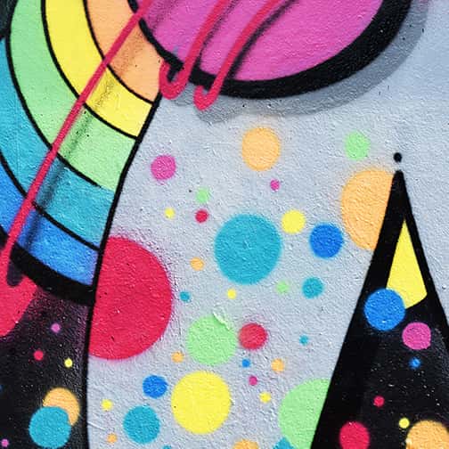
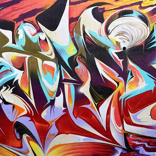
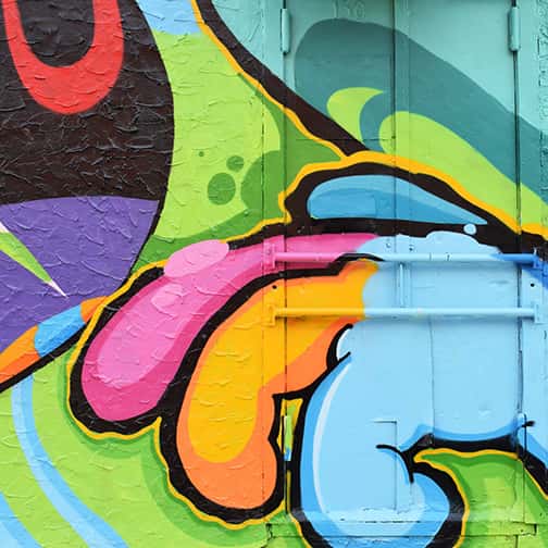
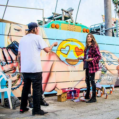
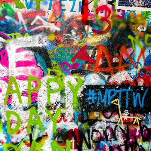

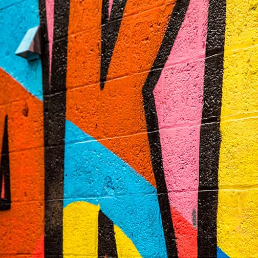
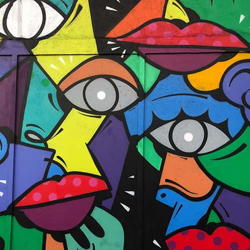
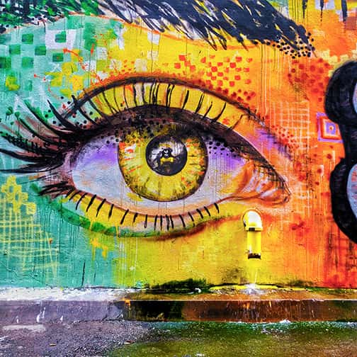

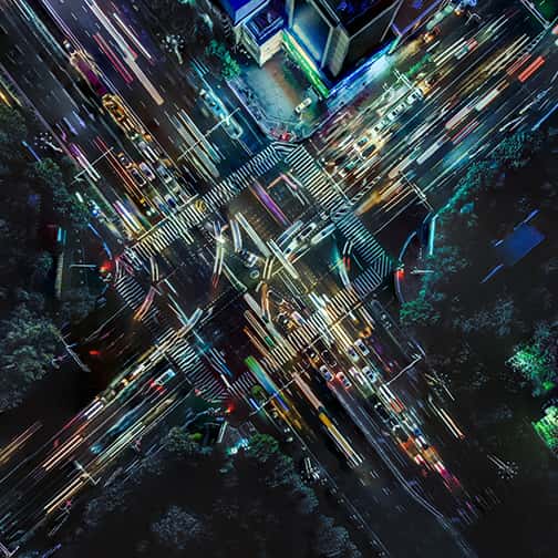
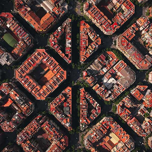
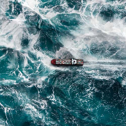
BIRD'S-EYE
VIEW







Meaningful
colors and fonts
to highlight content
Raleway
MAIN TYPOGRAPHYRaleway is a modern and strict sans serif font. Its design brings energy and structure to the brand. It also underlines a certain zeal and gives our brand a real youthfulness. This elegant family of sans serif typefaces is designed for the latest look, without losing sight of the letters.
Baton Turbo
WEB TYPOGRAPHYBaton turbo is a very trendy sans serif font. Its design brings clarity and enthusiasm to the brand. It also underlines a certain passion and gives our brand a real optimism. This elegant family of sans serif typefaces is designed for the latest look, without losing sight of the
Open Sans
SECONDARY TYPOGRAPHYThis clean and distinctive designed font is the perfect complement to the main typeface. It is a modern and commonly used sans serif font. In the spirit of the time, it will allow for smooth and fast reading. It is a discreet and elegant font that will appeal to the widest range of readers.
Colors of the logo
LIGHT COLORSThe main colors, light colors, underline the strength of the logo and its visual identity and must not be altered in any way. Gradient colours are used to underline the forward-looking nature of SBS. Gradients are major elements of the brand’s visual identity, but their use should be kept to a minimum, particularly with regard to titles and text. Overall consistency must be based on harmony and legibility.
Colors of the assets
DIGITAL COLOURSThere are five main gradients that are used by each major section of the website (Platform, Solution, Delivery, Insights, Company) and five secondary gradients that are rather used in the background.
